The style.css file is the file you can use to customize your game fonts, your stat bars (i.e. the colors of them) and some other aesthetic things, like the color of the "Next" button.
This file uses CSS, a styling script that determines how elements are displayed on the screen. This articles covers the basics, but the customization has no limits. If you want to learn more about CSS, W3schools has excellent tutorials.
Firstly of all, open the style.css file in your game files (..\web\style.css) preferably with a program like Notepad++ (that has syntax highlighting), and follow the instructions below to change various aspects of your game's display.
Font and font size
Changing your game's font is done easily. In the first block of code named "body", look for this line of code:
font-family: Georgia,"Times New Roman",serif;
Georgia is the font the game uses by default. This is what you want to change. You could rename it to "Helvetica", "Garamond", "Arial"... just write the font's name with the first letter capitalized.
Note that the font you choose should be a common one, found on most computers, otherwise, it will default to the second font in the list, "Times New Roman". This is why you should leave ""Times New Roman", serif" alone and only change "Georgia", just in case.
To change the size of the text in your game, find the line:
font-size:100%;
You can increase the font size by changing it to "150%" for example, or decrease it by changing it to "80%".
Background color
To change the background color of your game, look for this line in the first "body" block:
background-color: #F7F4F1;
There, you can see the "F7F4F1" color code. That color code is composed of 3 pairs of 2 characters, with the first pair representing red, the second green, and the third blue. The pair "FF" is the strongest (255) while the pair "00" is the weakest (0). So white would be "#FFFFFF" and black is "#000000". For more info on color codes, and finding the perfect color, go to W3schools color picker.
Tweaking the stat bars
Stats can be displayed in bar form, and that bar can be customized to your satisfaction. Here's how. (See the Stat Screen article for more information on stats and their display.)
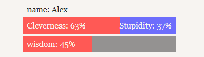
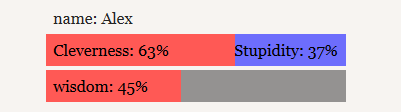
We will be using the following example to illustrate the color changes:
As stated above, colors are coded with HTML color codes like "#F7F4F1". For more info on color codes, and finding the perfect color, go to W3schools color picker.
Stat bar background color
By default, the background color of the stat bar is gray when there is no opposing pair to a displayed stat. To change this, find the line:
.statBar {

  background-color: #949291;

  [...]
}
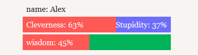
If we change #949291 to #00b359, which is a green color, this is how the bar will look:
Stat background color
To change the default red color of a stat, find the following line:
.statValue {

  background-color: #ff5955;

 [...]
}
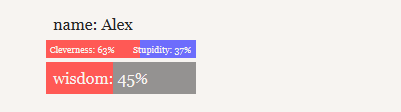
Changing the red #ff5955 to the green #00b359 as before shows:
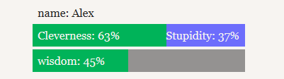
Notice that this affects all the stat bars, no matter if they are displayed as percentage or opposed_pair
Opposed stat background color
To change the default blue background color of the opposed stat in a pair, find the following line:
.opposed {

  background-color: #6D6DFC;

}
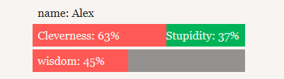
Again, changing the blue #6D6DFC to the green #00b359 will show:
Stat bar text color
In order to change the color of the text displayed on the stat bar, find the following line:
.statBar {

  color: #f7f4f1;

  [...]
}
Changing color to #000000 (black) will show:
Bar width
Additionally, you can adjust the width of the stat bars by changing this line:
.statBar {

  width: 300px;

  [...]
}
It isn't recommended to lower this value, since the stat text adjusts depending on the width. Setting the width to 150px, for example, has quite a comical effect:
But if you set the width to:
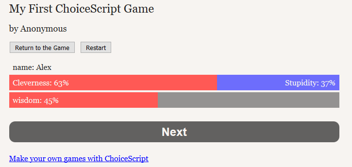
width:100%;
The bars will span the width of the game itself:
Changing the display of choices
Choice options border
The lines around the options can be modified by changing these lines: .choice label {
   border-color:#a9acaf;

   border-style:solid;

   [...]
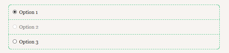
} For example, if you change the border-color to green and the border-style to dashed like this: .choice label{
   border-color:#00b359;

   border-style:dashed;

   [...]
} Options in a choice will display like this:
Greyed-out options' color
You can change the display of options that are disabled and greyed out through the use of the *selectable_if or *disable_reuse commands. Look for these lines:
.choice .disabled {

  color: gray;

}
And change the word "gray" to the color of your choice. Again, for more info on color codes, and finding the perfect color, go to W3schools color picker.
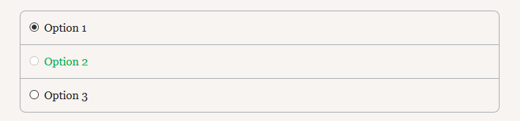
Changing this to the green #00b359 value will show:
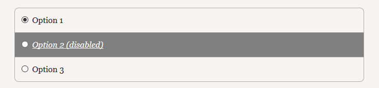
You can, of course, add lines to this block to make the text italic, bold, underlined, and even change the background color of the option, such as:
.choice .disabled {

  color: white;

  background-color: gray;

  font-style:italic;

  text-decoration: underline;

}
Which will display:
Changing the display of the "Next" button
In this section we will be exploring how to change the appearance of the "Next" button. The changes made here apply to both the "Next" button created by a *page_break command and the "Next Chapter" button created by a *finish command. To learn how to change the wording of the button, please see the respective command pages.
Width of the "Next" button
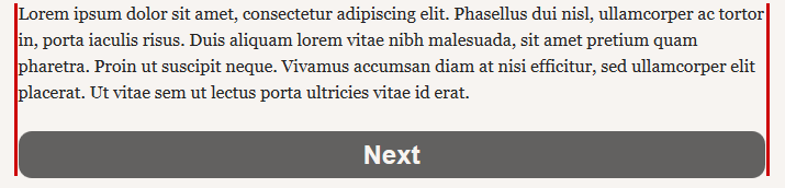
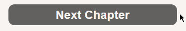
By default, the "next" button is set to 100%, which makes it as wide as the game, as you will see highlighted in red in the following picture:
The following line controls the button width:
.next {

   width:100%;

   [...]
}
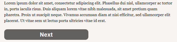
If we set the width to 50%, this is what the Next button will look like:
Background color of the button
To change the color of the button itself, look for this line:
.next {

   background-color: #626160;

   [...]
}
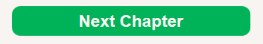
We can change the color code #626160 (grey) to #00b359 (green). (For more info on color codes, and finding the perfect color, go to W3schools color picker). The button will then look like this:
Font color
When it comes to the color of the writing, there are two things you can change: the color of the words at rest, and the color when the button is hovered over with the mouse.
To change the color of the words "Next", find the following line:
.next {

   color: #f7f4f1; /* Match background color */

   [...]
}
This line shows the color of the "Next" word (NOT the button itself, but the word "Next" only!). If you do not match that with the background color, you will not encounter an error, but it's more appealing if you do so.
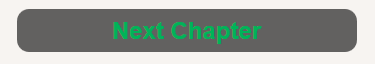
If we change this to the green #00b359 as before, the button will look like this:
Notice that after changing the color of the words as above, the color changes back to white when you hover over the button with your mouse. This is because another color line controls the color when the button is hovered over:
.next:hover {

  color: #E4DED8;

}
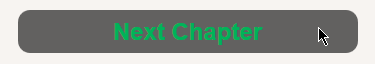
If you change this color code to green (#00b359) as above, the "Next" will turn green when you hover over the button, as such:
Font size and style
The following lines control the font size and style in the button:
.next {

    font-size:1.5em;

    font-weight:bolder;

    [...]
}
The first line (font-size;1.5em;) determines how large the font that says "Next" is. The unit "em" means the size is relative to the current font size of the element; 2em = twice the font size. This line accepts units such as pixels (px), point (pt) and percentages (%). So you can experiment by changing this to font-size:12px; or 14pt or 150% for example.
The second line (font-weight:bolder;) determines how thick the characters of the word are. This can be changed to the following values:
- normal, which is the default normal character thickness
- bold, which defines typically thick characters
- bolder, which defines extra thick characters
- lighter, which defines extra thin characters
You can add a few lines here to make the "Next" text always appear italic or underlined. Here's how.
To make the button text italic, you can add the following line to the .next block:
font-style:italic;
To make the "Next" text always underlined, you can add:
text-decoration: underline;
Text decoration also supports overline and line-through, which respectively create a line over the text and a line through the text. You can combine these by simply adding these to the text-decoration as such:
text-decoration: underline overline line-through;
So if you change the code the following way:
.next {

    font-size:1.5em;

    font-weight:lighter;

    font-style:italic;

    text-decoration: underline overline;

    [...]
}
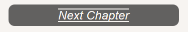
The button will end up looking like this:
Additionally, if you add those lines to the .next:hover block instead like this:
.next:hover {

  color: #E4DED8;

  font-style: italic;

  text-decoration: overline underline;
}
The text decorations will only appear when the button is hovered over with the mouse, and the text will turn italic.
More changes
The other code lines in this file aren't making any major changes like the ones above, so they are not covered here; although, don't mess with them if you do not know how to use CSS (Cascading Style Sheets).
If you want to learn more about CSS, W3schools has excellent tutorials.